
Visual Research Studio
is a graphic design agency that brings social research to life
by co-creating with your target audience.
By making your research truly accessible,
we help you create real impact.
Turning reports into change
1
Research reports are often packed with text. For the very people they’re about, that text is usually hard to understand.
By involving your target audience in the creative process, we find the right way together to present the results so they actually make sense,
for everyone.


Complexity
2
Listening
In our sessions, we explain how research is conducted, why change often takes time, and how challenging it can be to reach decisions together.
In return, the target group advises us on how best to reach them - whether through a flyer, an interactive infographic,
a website, or social media - and which results truly resonate with them.
3
Designing
With your feedback in hand, I get to work.
Clear visuals, accessible language, and interactive elements come together in a design that speaks to both professionals and the people at the heart of the research.
4
Sharing
We share the final product with all stakeholders, who can then spread it further within their own networks. Together, we create wide visibility and real impact for your research.
5
Change
The first step toward change has been taken. Through dialogue, you and your target group have gained new insights into each other’s perspectives. A strong connection has been built, making the audience part of something bigger.
That’s fertile ground - for future research, and for real, lasting change.

Low Literacy
Interactive infographic
In collaboration with Judith and Joyce from Edloket (Amerpoort Amersfoort), I created an interactive infographic based on the 2018 research on low literacy in the Netherlands.
Designed for computer or laptop use.
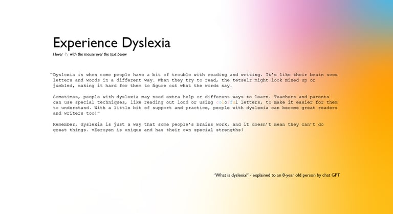
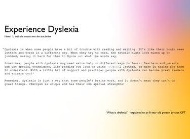
Dyslexia
Interactive experience
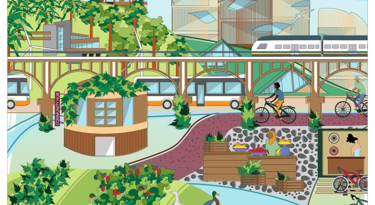
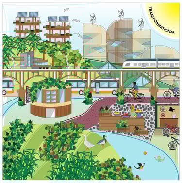
To visualize the diversity and complexity of perspectives and ideas in the Circular Economy (CE), P.M. Martin Calisto Friant (PhD) developed a 2x2 model of circular discourse types. I assisted him in designing a visual presentation of these four types.
Created for digital use in the CRESTING Project Europe.
Cresting Project
Visualizations
Research shows that 30% of primary schools had 10–19% of their students taking the final test with a dyslexia declaration. How do you explain dyslexia to a child, and what is it like for someone with dyslexia to read a text? This case study allows people without reading or writing difficulties to experience a form of dyslexia.
Designed for computer or laptop use.
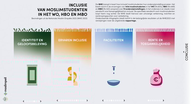
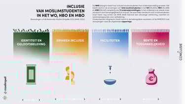
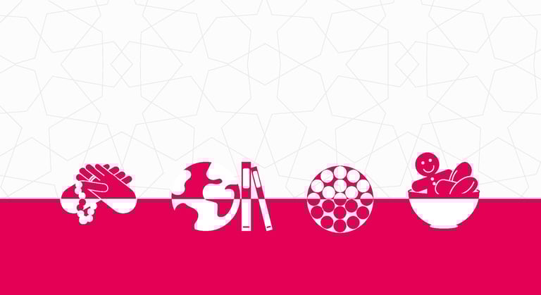
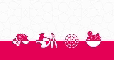
Inclusion of Muslim Students
Interactive infographic
The National Muslim Survey 2023–2025 maps how Muslim students experience their educational institutions (MBO, HBO, or WO). Together with students from various levels, we designed an interactive infographic that can be personalized by both students and institutions, for example, in presentations.
Designed for digital use.
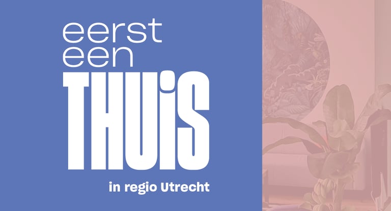
Eerst een thuis (“First a Home”)
Report
‘Eerst een Thuis’ is a new approach to addressing homelessness in the Utrecht region. Commissioned by the Municipality of Utrecht, the Research Group Housing and Wellbeing at Utrecht University of Applied Sciences conducted research on this approach between April 2021 and February 2024. I was asked to design the report.
Designed as a print version.
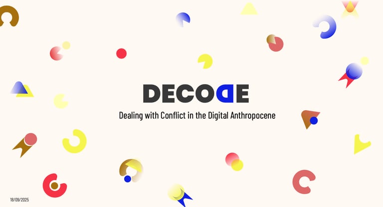
DECODE
Communication toolkit
Labyrinth research agency asked for an infographic for a study on the needs and housing preferences of caravan site residents in Maastricht. The designs were reviewed by several residents to ensure that the people who contributed to the research could actually understand the results.
Designed for print.
Research on travelling community residents
Infographic
What does digitalization mean for how citizens and governments interact around concrete issues in the city? This question is central to Tilburg University’s ‘DECODE’ project. I designed a communication toolkit that the team can use across all communications related to this project.
Designed for both print and digital use.
National Muslim Survey 2024–2025
Toolkit - Reports
The National Muslim Survey 2023–2025 maps how Muslim students experience their educational institutions. I helped design the reports, toolkit, and an interactive infographic, co-created with Muslim students from various levels.
Designed for both digital and print use.
Work
Clients
Visual Research Studio - Participatory Designer - Graphic & Interactive - Utrecht, the Netherlands - mail@visual-research.studio